|
Purpose
 The
document is to be used as “basic training” manual for
people who intend on playing Medal
of Honor Frontline. The instructional booklet can be read
from cover to cover, but will more likely be scanned by the
user to find out how to move about in the game and execute
commands such as aiming and firing one of the various weapons
in the game. The
document is to be used as “basic training” manual for
people who intend on playing Medal
of Honor Frontline. The instructional booklet can be read
from cover to cover, but will more likely be scanned by the
user to find out how to move about in the game and execute
commands such as aiming and firing one of the various weapons
in the game.
The
document provides instructional information so when the user
first plays the game they have a “good gaming experience”
and are not frustrated by not being able to “do well”.
This builds the ethos of the game-system company, EA Games™
and the Medal of Honor™ game series.
When
not being used the document is stored inside the plastic case
the game and the document comes in.

Audience
The
document in intended for users aged 13 and
up, with motor
skills and decent hand/eye coordination (basic ability to play
videogames) – otherwise they will not have a good gaming
experience. The target audience of the game – and thus the
document – is 18 to 30 year olds. This group has the
disposable income to spend on videogames and a general
interest in playing videogames. The document also assumes the
user has an interest in first person shooter games and/or in
history, and/or in World War II. The document assumes the
audience has a Playstation 2 Entertainment System and
television and intends to play the game.
Context
The
document is primarily a reference guide, as most users will
only refer to the document when they have been unable to
discover for themselves how to perform specific actions in the
game. Thus the document will most likely be read in front of
the television while the game is paused or loading.
Text
All
the body text in the document is in a Sans-Serif typeface
which allows for easy scanning of the document. As well, there
are few paragraphs of text that are longer than four lines, so
linear processing is not a major concern.
The
headings and subheadings in the document are in a Stencil
typeface that imitates the user’s idea of traditional
military text. This typeface adds to the “realism” of the
game, as well as, being a clear and easy to read typeface over
a short span of text.
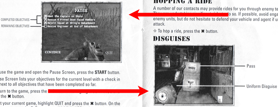
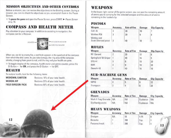
Graphics/Images
The
entire document, except for the front cover, is black and
greyscale. All the images, with the exception of the four
different watermarkings for background, are screen
captures.
The
screen capture images are small, fuzzy and because they are
printed in greyscale, hard for the user to distinguish
individual elements within the image. Use of colour for the
images would have been an effective enhancement for the
document. Due to the image’s small size, the colour would
not have created an excessive level of sugar, while making the
images easier to process. Having said that, using a colour
photo may have spoiled some of the ambiance of the game and
its attempt to portray a vintage World War II environment.
But, there was colour photography during that time, and because
it was expensive would have added to the overall ethos of EA Games.
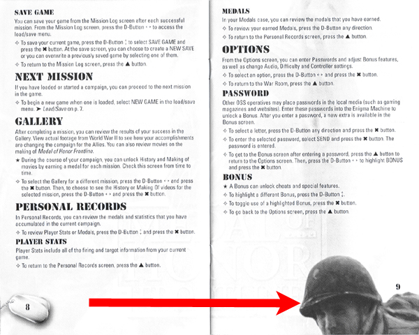
The
watermarkings on the page are a unique addition to the
document. They add a note of elegancy and promote EA Games’
ethos by showing the company is not afraid to spend money –
a good thing when you consider the process of game
development. However, two of the watermarkings add too much
noise to the pages they appear on by showing the head of a
solider on the recto or
verso page (depending on which
watermarking is used). The image of the soldier’s head is
larger than the screen capture images and the relatively dark
colour of the soldier’s head makes it the most salient image
on the page distracting the user from the information in the
document.
|