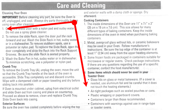
 After
reading the document for the first time, it is to be filed
away and stored for future reference. Thus, for example, when
it comes time to clean the Toast-R-Oven™, the user can
reference how to do so and perform the activity without
damaging himself or the Toast-R-Oven™.
After
reading the document for the first time, it is to be filed
away and stored for future reference. Thus, for example, when
it comes time to clean the Toast-R-Oven™, the user can
reference how to do so and perform the activity without
damaging himself or the Toast-R-Oven™.

Audience
The
target audience of the document is North American (the
document is printed in English, Spanish and
French) people who
have purchased/own a Black & Decker Toast-R-Oven Classic™. The document assumes the
user has the appropriate facilities to use the Toast-R-Oven™
(polarized electrical outlet) and maintain it (access to hot
sudsy water for cleaning).
The
document also assumes the user is of competent age and has the
need to use a Toast-R-Oven™ – why else the user have
opened the packaging and gained access to the document.
Context
In
most cases, the document will be used in the kitchen – that
is where the Toast-R-Oven™ will be used/stored so it is
logical to assume that is where it will be opened.
Since the document is intended to be read before
operating the appliance, this location is the most likely
place for the document to be read.
As
well, the document is quite large when completely unfolded,
but is easily managed for reading when spread on a
flat surface like a countertop or kitchen table.
Text
The
document is printed entirely in a Sans-Serif typeface which
promotes the document as an authority – if you follow these
instructions you will be safe and experience years of premium
cooking/baking results.
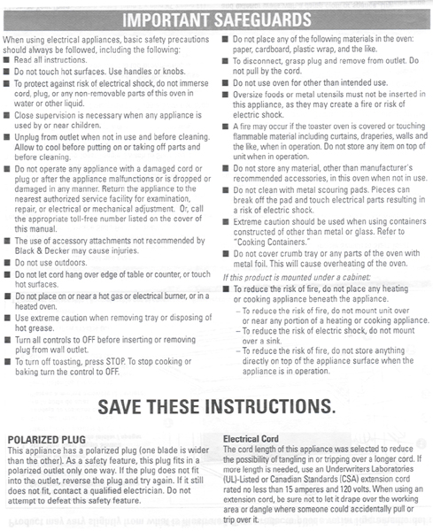
However,
there are lengthy instructional and warning paragraphs that
the Sans-Serif face does not support, namely linear
processing. This is overcome by numerical
lists and bold-square-bullet-points that
indicate individual pieces of information, allowing for easier
scanning of the document – the user scans a paragraph until
he sees a key word in the bulleted paragraph and decides
whether or not the information is necessary to read or if he
can skip on to the next point. The segmenting of information
is aided by the Gestalt Principal of Proximity – the extra
white space between bulleted paragraphs signals to the user
that each bullet point signifies a single instruction or
warning.
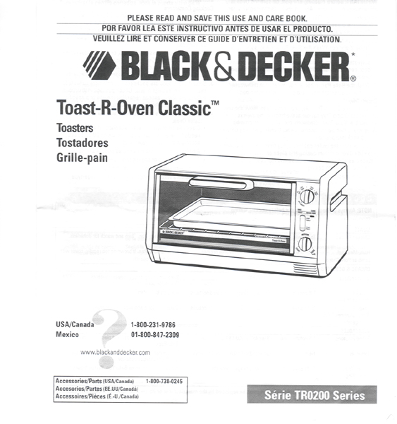
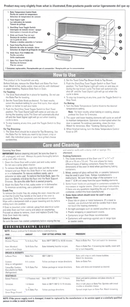
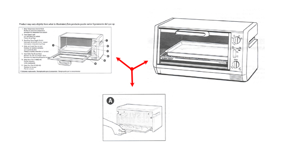
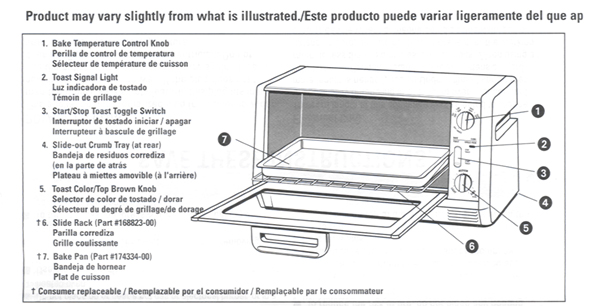
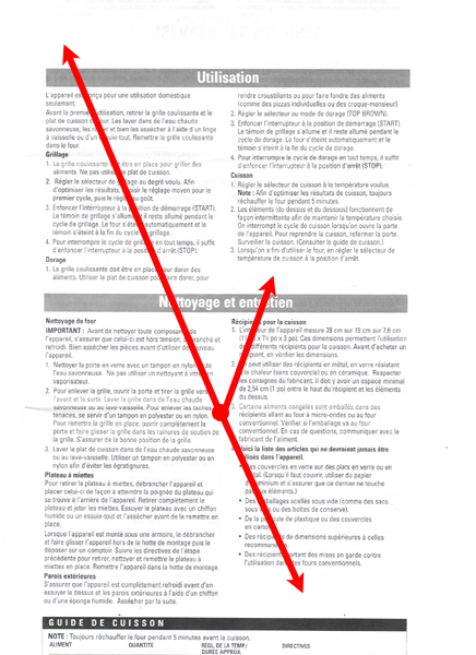
Graphics/Images
There
are three diagrams in the document. The use of diagrams is
effective because they give a detailed depiction of the
Toast-R-Oven™, and combined with the Sans-Serif typeface,
creates a synergy for an authoritative tone in the document.
The
black figure on a white ground creates little noise so the
user is not distracted while assessing the individual
components of the Toast-R-Oven™.
However,
the diagram depicting the Toast-R-Oven™ and its components
creates far too much noise because it uses all three languages
(English, Spanish and
French) in its
description/identification. This could have been avoided by
placing a diagram of the Toast-R-Oven™ at the top of each
language section which would have created symmetry with the
Cooking/Baking Guide table at the bottom of the column – two
boxed pieces of information sandwiching written text.
Layout
Once
completely unfolded, the “interior” (side without the
‘cover’ of the folded version) is well laid-out. Each
language has its own separate page, allowing the user to find
the section in their language and disregard the others.
However there is a significant amount of white
space that
could be eliminated by starting each individual segment with
its own diagram.
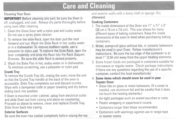
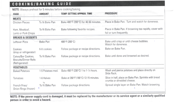
The
layout of the Cooking/Baking Guide at the bottom of each
section is well spaced and organized making it easy to read
and assimilate information.
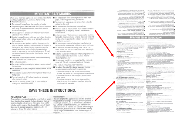
However,
the exterior portion of the document is poorly laid out, with
information in each language appearing in two separate
locations. The English version of the safety instructions are
the first thing the user sees when he unfolds the document.
However, the safety instructions are separate from the
warranty section. The user, who is accustomed to having all
the English portions of the document grouped together, may
miss the warranty section and waste time trying to locate this
portion of the document. Any frustration the user experiences
will be directed towards the company, diminishing their ethos.
The
reason for putting the warranty on the last page – “out of
sight” – is the company’s way of saying, “You won’t
have any problems, but if you do, here is what you do.”
However, this attempt to build ethos is severely undermined by
the possibility of creating any level of frustration the user
may experience while using the document.