|
Purpose
 The
document is a job card, intended to be used once -
while installing the Towel Holder - and then discarded
after use. The document has no exceptional design
characteristics because it is intended to be mass
produced and used on the packaging of the entire
Designer Collection’s product line – you get the
same installation guide for the Towel Holder as you do
for the Towel Rack and Clothes Hook. The
document is a job card, intended to be used once -
while installing the Towel Holder - and then discarded
after use. The document has no exceptional design
characteristics because it is intended to be mass
produced and used on the packaging of the entire
Designer Collection’s product line – you get the
same installation guide for the Towel Holder as you do
for the Towel Rack and Clothes Hook.

Audience
This
document is designed in particular for Do-It-Yourselfers
(DIY) who have some experience with home renovation and/or the
use of tools.
The
audience must have the need to install a new Towel Holder.
This could be inspired by: a renovation, building a new
bathroom, upgrading for aesthetic value or replacing a broken
Towel Holder.
The
audience is massive, as the document has all of the
instructional text written in three different languages: English,
French, and Spanish. This means the document can be
sold anywhere in
North America
because it uses the three official languages in the region –
supporting its mass production characteristic.
Context
The
document is intended to be used in the bathroom (project site)
while the installation is taking place. Once installation is
complete the document is then discarded.
The
document is also intended to be used in the aisle of the
hardware store, so a potential buyer can examine the project
and assess whether or not they – or a significant other –
can complete the task.
Text
All
of the text used in the document is a Serif
typeface, with the exception of the company’s
logo. The Serif face gives the document a human
touch, hinting at the idea a professional contractor is
watching over your shoulder while you complete the project.
However, the document runs the risk of the helpful
professional turning into the know-it-all friend due to the
lack of authority generated by the text.
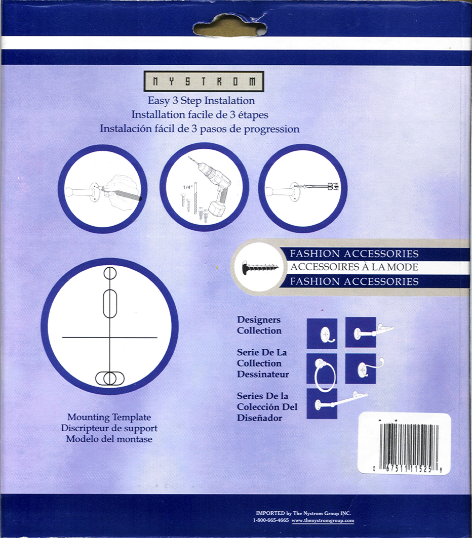
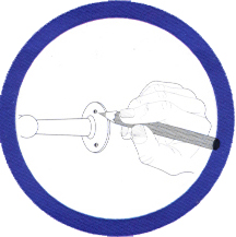
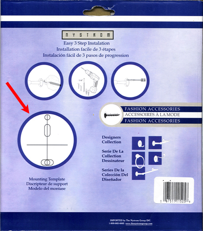
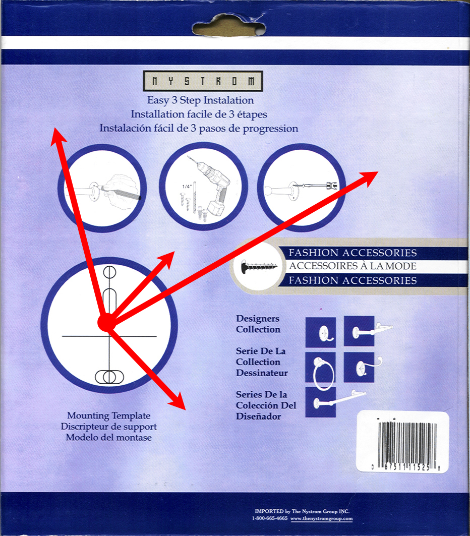
Graphics/Images
The
document does an exceptional job using graphics. The white
ground and black figure provide a perfect contrast so the user
does not struggle to decipher the information. As well, the hand-drawn
images promote the “human touch” mood already
established in the document by the Serif typeface.
The
images themselves are well laid-out using the Gestalt
Principals of Grouping, Common Space, and Closure. The
“Three Easy Steps” are easily identified by their close
proximity to one another (you see step one, two and three all
in a row) and the thick dark border enclosing each image
indicates that each image is a complete step.
Colour
The
blue colour scheme and dominate blue background are an
excellent choice for the document as it calms the user and
helps to alleviate any anxiety the user feels about doing the
project. If the user hits a snag while completing the project
and must refer back to the document, the blue colour will help
to calm the user and focus once more on the project.
Layout
The
layout of the document is exceptionally poor. The most salient
(and important) object in the document, the Mounting
Template,
is in the lower left corner of the document. According to the
Gutenberg Theory, this goes against a Western user’s natural
instinct to read a document from upper left to the lower
right.
As
well, there is no semblance of a grid system being used which
leads to a lot of open/white
space while the graphical elements of
the document are cluttered together in the middle creating a
lot if unnecessary noise.
Conclusion
The
entire document is intended to build the ethos of the Nystom
Company, in that if the installation goes well for this
project, the user will purchase other products because they
should be just as easy to use. However the document lacks in
several key areas, namely the tone – lack of authority –
and layout – too much noise when there is so much white space and the placement of the most salient and important
object on the document in the lower left hand corner of the
document.
|