Pearl Jam's CD Layout for 'YIELD'
 |
 |
|
|
|
 |
 |
 |
|
|
|
|
|
|
|
|
|
|
|
|
|
|
|
|
The audience for this CD are loyal and diehard Pearl Jam fans. More than likely they are in their early to mid-twenties and have followed the group since its debut in 1991. The group may also be trying to attract new fans who have not followed Pearl Jam very closely.
![]()
The purpose of this CD is to sell Pearl Jam's music to both its loyal fans and new fans. Another purpose is to develop a strong and credible ethos and tone for the band and the album.
![]()
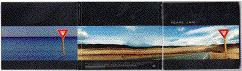
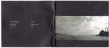
The CD case is normal in case size, but is not made of hard plastic. It is a fold out design containing three sections, and is made of stiff but thin cardboard. The inside is made of the same material as the outside, but the middle section contains the actual CD held tight in a plastic holder. The booklet which accompanies the CD is located in a jacket inside the last section of the case. The booklet is made of thin, cheap paper, and is highly portable. The CD Case and its contents are meant to be taken anywhere because of their small size, or to be placed in a CD rack or display.
![]()
![]()
There are three different typefaces which run throughout the CD layout. The first is a sans serif face, appearing in 18, 16, and 8 pt sizes. This type face is extended in either all upper case or all lower case. It is never a mixture of both. It appears in either red or white colouring as well. The extended typeface builds the tone of the layout because it complements the "wide-open" and sense of consciousness expansion which the entire document develops. The second typeface is found on the CD itself, and is a sans serif, 48 pt size. The letters are red, and all upper case. This typeface enhances the arrangement of the album because it is the same typeface found on the YIELD road sign, which also adds to the clarity and conciseness of the layout. As well, this large typeface enhances emphasis, since it stands out well against the white background and catches the eye immediately. The third typeface is actually the lead singer's(Eddie Vedder) hand writing. It is white and appears in either all caps or a mixture of upper and lower case, in sizes of 12 and 10 pt. This typeface enhances the tone of the layout because it adds to the personal and intimate feeling of the design. Since this typeface is Vedder's own handwriting and appears to be scribblings, it decreases the clarity, because it is somewhat hard to read.
![]()
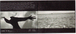
At the inter level, on the front cover of the CD case is the name of the band situated to the left, approximately 1/3 down the front. It has plenty of black space around it and easily stands out enhancing the ethos, clarity, and conciseness of the document. On the back of the CD case at the bottom is the text that identifies the names of the songs on the album. The text is left justified. The names of the songs are quite small, and almost seem like copywrite information at first glance. This fact decreases clarity, and emphasis because they are quite hard to read unless you look very hard. Yet this fact enhances the tone and ethos of the CD layout because of this deemphasis: the names of the songs are not important, it is what is behind and inside the songs which count the most. On the front of the booklet, which accompanies the CD, is the title of the album(YIELD). It is located to the right, approximately 2/3 down the page. The red lettering on the black background is hard to pick up at first, and does not stand out very much, decreasing clarity. Inside the booklet, located at the top is the text of the lyrics. It is quite small and is hard to read, decreasing clarity, but also enhancing the tone and ethos, since you must concentrate on the words closely; again the personal and intimate feeling. At the bottom of the pages are the names of each song, as well as the composers and writers. The name of the song is left-justified while the composers/writers are right-justified. This helps to increase arrangement, and enhances the ethos, giving it a personal touch. Again though, these groupings of text are hard to read at times and hinder clarity.
![]()
There are many extra level elements in this CD design. The photographs which run throughout the document come in both full colour(on the outside of the case), and black and white(in the booklet). They start about 1/3 down the page and end near the bottom margin with a half inch of black space separating the bottom of the photo with the bottom margin. The photos have a full bleed off the page horizontally. Because of their positioning on the page, the good amount of black space at the top and bottom, the full bleed and the content, the photos act to heighten arrangement since everything is arranged around them. The photos also enhance emphasis, ethos and tone, because they stand out more than anything else in the layout, and their content suggests freedom, nature, personal feelings, and life discovery. Another extra level element is the thick red circle running around the inside of the physical CD. It enhances conciseness and clarity because it closely resembles the colour and arrangement of a YIELD roadsign(several of which appear throughout the whole document).
![]()
The CD case is a fold out and has three sections. This fact as well as the fact that it is not plastic like most other CD cases enhances the tone and ethos of this document--it is unique and groundbreaking. The layout of the photographs on both the cover and inside of the booklet are all placed in the same position which enhances the arrangement because of the consistency, and clarity. All the lyrics are placed at the top spanning the entire booklet, and all the names of the songs are placed at the bottom of the booklet. This enhances arrangement further, and clarity because the reader is able to learn where everything is after only a short perusal through the booklet. The CD itself enhances the tone and clarity of the whole layout because its design is in keeping with that of a YIELD road sign. The use of the black bars at the top and bottom of the CD cover and booklet are the same size and enhance the arrangement of the whole document.
![]()
This document works beautifully, largely because of the consistent arrangement and clean design, but more importantly because of its tone and ethos. It speaks of freedom, and nature. The pictures are the document's strongest feature, because of their content, layout, and emphasis which they are ascribed.