understanding usa: usa interactive images
Audience: Understanding USA is a book conceived and compiled by Richard Saul Wurman, first published in 2000. Its self-proclaimed goal, as laid out in the book's introduction, is to "make information public": "Making information public is somewhat less generic. This public means presenting, designing & structuring this information so that it is accessible, available, understandable & free [...] This book is a celebration & a visual demonstration of questions & answers leading to understanding." Or simply put, the book is a compendium of "pictures of numbers" - graphs, charts, and other ways of visually presenting data.
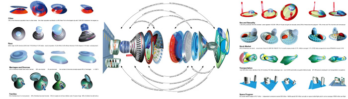
Understanding USA comprises a number of different chapters about different topics such as "Crime and Punishment," and "Cost of Living and Poverty," with each designed by a different graphic designer (or "information architect," to use Wurman's term). Here, I am going to examine a selection of images from a chapter of the book entitled "USA Interactive," created by Hani Rashid and Lise Anne Couture, two New-York based architects.
As can be seen through the wide net cast by the introduction, the proposed audience for these images is made up of "the general public," or nearly anyone who is interested in learning more about America. More realistically, this audience is most likely already interested in issues of information design.
Purpose: These images present data about the United States in a visual, and visually pleasing, way. The assumption is that the data will then become more easily transformed into knowledge.
Context: The print book is available fairly widely in bookstores, and downloadable in its entirety for free through the Understanding USA website. The images I am using come from the website, which is most readily accessed with a fairly recent make of computer and a high-speed Internet connection.
Ethos: Richard Saul Wurman is a design guru who coined the term "information architecture," and whose mantra is to "make the complicated clear." In the magazine Fast Company, his Five Rules for Information Architecture include "#4: To decide which information is worth keeping, determine what you really want to know," and "#5: Most information is useless. Give yourself permission to dismiss it." Therefore, what USA presents is not simply statistics about the GDP or the number of cars per capita. It is a complete rhetorical stance, defending an entire theory of information design. These particular images by Rashid and Couture are but part of a larger argument.
Information and Shapes: Despite the initial thought that "something very complex must be going on here," which was provoked by the translucent 3-D shapes, upon closer inspection, there's actually a very small amount of information contained in these graphics.
In the Sex & Sexuality image, there are basically 4 informational features: percentage of homosexual men and women; percentage of sexually active 16 year old girls and the percentage of those who will become pregnant; types of birth control used; and the total number of prostitutes, including the number of those under 18, and arrested). They are then morphed into shapes that share no distinguishable scale of measurement and that are colored according to no discernable logic.
The Race and Space Program images are likewise devoid of meaning. The Space Program graphic has only 2 major data aspects. The Race graphic combines "Racial Composition of the U.S. Population" and workforce information on to the same silver shape, which could be interesting, but ultimately fails as the two data sets are not related to each other, other than being placed on the same silver shape. (The Race graphic also resembles a flying saucer, which may or may not be intentional, depending on to what extent the designers embrace Afro-futurism.)
The Cities graphic has one major flaw: in presenting the two statistic sets of "10 most populated U. S. cities" and "Population of the largest counties in the U. S.," they are organized in ascending order but opposite directions around the spiral. While this makes the 3-D shape symmetrical, it is highly counter-intuitive.
In general, the premise that a 3-D shape can represent different sets of related data is a promising one. However, these graphics - radical departures from traditional information design standards - fail mainly because the 3-D shapes used are seemingly arbitrarily chosen, and require more accompanying text explanation than should be necessary. If the 3-D shapes were all plotted on a common grid where a unit of space could correspond to a numerical unit, and color was used to label, these images could be more useful. The American Demographics and Datascaping America images hint at how graphs in the form the 3-D shapes could fit together to form a coherent whole and how they can be rotated to reveal new perspectives on the information presented. But in this failed escape from flatland, the superficial dimensionality of the display is increased without a proportional increase in the density of the information.