tokyo metro guide
Audience: This Tokyo Metro Guide is a quick-reference guide to the Tokyo subway system in 5 different languages: Japanese, English, Korean, Traditional Chinese, and Simplified Chinese. As such, this guide caters primarily to foreigners, and serves as an introduction to the intimidating world of the Tokyo Metro.
Purpose: The guide has 2 major informational features: approximately half of the guide is devoted to the basics of "How to ride the subway," which involves entering the subway station, buying a ticket, and leaving the station, while the other half of the guide is devoted to a map of the subway lines, with information as to which major Tokyo neighbourhoods and/or attractions are located at which subway stops.
Context: The brochure is available for pick-up at locations where large concentrations of tourists would visit, such as airports, bus terminals, and hotels, as well as in the subway stations themselves. In use, the brochure would probably be clutched in a foreigner's sweaty hand as she navigates through the people-moving behemoth that is the Tokyo Metro. The guide's task immediacy is high.
Ethos: What is most important for this guide is to demonstrate the values of wisdom and goodwill. The Tokyo Metro Authority is already the undisputed authority on, well, the Tokyo Metro, so the first value is not too difficulty conveyed. However, the second is more problematic, as notorious tidbits about the Tokyo subway system circulate worldwide, the most infamous of which are the "people pushers," platform guards who help cram as many people as possible into the subway cars on the commuter lines during rush hours. There is even an entire book of photographs, titled Yamanote, by Inigo Asis, of salarymen on the JR Yamanote line, a major commuter line, looking supremely cramped and unhappy as the train doors open at each station. Like Japan on the whole, the Tokyo Metro suffers from the overseas misconception that it is cold, clinical, conformist, and only concerned with business. Riding the subway, the foreigner fears, might be the human equivalent of a sardine's experience of being canned.
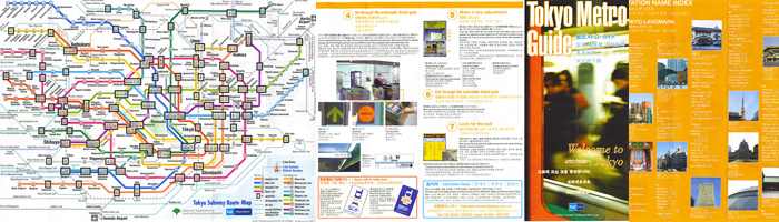
Materials: The full-color guide is printed on glossy paper, and measures approximately 6x15" when unfolded. It is first folded into half, and folded again in a z-fold with 3 panels, so that the panel that reads "Tokyo Metro Guide" is the front cover of the brochure. Unfolding the z-fold reveals the 3 panels that describe how to ticket information and general subway station functioning. Unfolding it again reveals the map, which is spread across 3 panels, and then the 3-panel "Station Name Index and Tokyo Landmarks" information on the orange background. When completely unfolded, the reading pattern starts at the map, the order in which I have arranged the close-up images of the guide.
Color: The predominant color of the guide is a highly saturated orange, conveying warmth with an underlying current of urgency. Blue - orange's contrasting pair - is used to highlight, and most of the photos incorporated are of blue tones. While most of the text is black on white, the "Station Name Index and Tokyo Landmarks" panels feature white on orange, which normally would be a questionable choice, but in this context serves to distinguish the index panels from the neighbouring map panels. Overall, the colors are bright and saturated, with a notable lack of neutral tones, suggesting friendliness (and not unhappy salarymen).
Map Usability: The map features the colored subway lines of Tokyo, each labeled with a letter, with each stop on the line as a number. The unique color and character of each line creates information redundancy, giving each line two methods of identification. For example, the Shinjuku line is "S" and muddy chartreuse. The letter-number system allows for cross-referencing between the Station Name Index and the map, allowing one who is looking to get to a specific station find out which line they need to take quite easily. The numbered stops also allow the user to count the number of stops they need to stay on the train for before they disembark, a highly useful tool when station names are announced in a foreign language over the train's PA system. Numbers transcend language barriers.
The most interesting aspect of the map is that it is not to scale. The subway system of Tokyo (a to-scale line drawing of which can be seen at Subway Systems of the World), which would more naturally fit in a square shape, has been compressed into a rectangle, with the central lines enlarged and the outlying lines shrunken. As such, it does not denote the actual distance between stops. For example, the Shinjuku line, as it nears Narita Airport in the upper right corner of the map, covers much more distance than simply looking at the length of the green line would reveal. From the map, it is hard to visually judge how long it would take to get from one stop to another, other than assuming that the number of stops in between the origin and the destination is proportional to the distance. However, this assumption is perfectly valid, and the lack of an accurate scale allows for all the stops on the subway lines to be included in a small surface area. Furthermore, on an introductory metro guide for foreigners, it is an appropriate design decision to focus on the central Tokyo lines, and de-emphasize the outlying suburbs.
Generally, this Tokyo Metro Guide tries its best to please the tourist by minimizing the intimidating features of the Tokyo subway system. "Cheer up," it says, "you'll it make out alive!"