cnn election night map
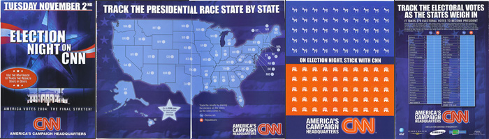
Audience: This CNN Election Night map of the United States, with accompanying stickers to mark states Republican or Democrat, was designed to allow television viewers to keep track of incoming results on the evening of November 2, 2004, when the votes for the Presidential Election were being tallied. As such, the audience would consist of the politically aware set, presumably watching CNN.
Purpose: Aside from serving as a useful tool during Election Night, the map is a suasive, used to advertise CNN's election night coverage and solidify its position as "America's Campaign Headquarters."
Context: This tear-out supplement was found in the October 25th issue of the New Yorker magazine. I do not know if this map appeared in magazines other than the New Yorker. After tearing it out, the user could keep it close to her bowl of popcorn in front of the television.
Ethos: Goodwill and wisdom are important to this document, as CNN is trying to demonstrate its helpfulness towards television viewers by providing them with a handy tool that allows them to participate in the mania of election night. Wisdom is supplied in the form of two informational sections, the first being on the verso of the sticker sheet that explains the origin of the donkey and elephant associations, and the second being the verso of the map fold-out, which explains the electoral college system.
The wisdom provided, however, is subtly skewed: as the verso of the stickers explains, the donkey was initially associated the Democratic party by the "famous political cartoonist Thomas Nash, [who] first drew the donkey to represent an anti-war faction with whom he disagreed." The donkey association, then, began as a derogatory statement. No wonder the Democrats have never "officially adopted its use." The donkey is "simple, courageous, and tenacious" - great adjectives for a loser - while the elephant has been adopted by the Republicans for its "dignity and strength" - clear characteristics of a winner.
Typography: A bold sans-serif typeface dominates all the headers of the document. The typeface on the recto that reads "Election Night on CNN" is also slightly shaded to create the illusion of three-dimensionality.
Color: The document makes heavy-handed use of shades of red, white, and blue - there is nary any other color to be found. These colors are obviously symbolic of America. Yet as the stickers denote, these colors are also partisan, with red signifying Republican and blue signifying Democrat. Therefore, despite the attempts at pure, non-partisan patriotism, blue remains in the background for all of he map, with red as the highlight colour. Of course, the CNN logo is red as well.
Graphics: Amongst the understated "we don't use very many photographs" pages of the New Yorker, this document certainly made itself known. The graphics used - the digitally altered "stars and stripes" that fills up nearly 60% of the recto, and the lit-up White House at night below it - is aesthetically aligned with CNN's television graphics. The use of shading throughout to connote dimensionality, especially the glowing edge around the map of the U.S. that corresponds with the glowing edge around CNN's logo and the glowing star just south of Texas, gives the map an impression of glamour.
Usability: While putting the stickers on the map during election coverage seems like it could be useful, America's electoral college system thwarts the simplicity of such an activity. For the map to be truly useful, each state on the map should have on it the number of electoral college votes it possesses, so that in the wee hours of the morning, one could look at the map and see the lone state of Ohio and that fateful number 20. Although the verso of the map, when folded, does have the table for counting electoral college votes, it is cramped into a relatively small space, while the map takes up the entire centre spread.
All of that aside, however, it is questionable as to whether a television watcher during election night would really need to go to the bother of doing mathematical gymnastics, when the television networks (CNN included) are repeating themselves every 3 minutes, and the Internet (CNN.com!) is always available.
In fact, the map and stickers really tell more about the entertainment mindset of CNN's election coverage: the animal stickers and the map, or some stunted game of Go. The verso of the sheet of stickers even has the heading "Party Animals," and the recto of the folded map reads "America Votes 2004: The Final Stretch!" The photo of the White House is decidedly cinematic; one half-expects The Schwarzenegger to appear at any moment. Oh... wait. I guess that bowl of popcorn is there for a reason.
Overall, the CNN Election Night map is a pretty transparent ploy, gleaming blue like the television, waiting for the red light to shine.